Interpreting Biplot
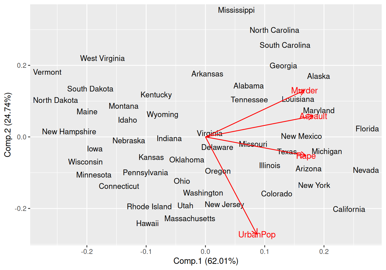
Obviously, the name suggests itself that there are two aspect of data plotted in latent scale. Biplot in case of principal component analysis (PCA) plot both variable and observation in latent scale (scores and loadings). Throughout this article, I will use USArrests data from datasets package. Lets fit a PCA model using princomp function. However, this can also be done using prcomp. The later one uses singular value decomposition while the former one uses eigenvalue decomposition. Here I have used correlation rather than covariance to compute principal components because there are large values in case of Murder and UrbanPop
pc.a <- princomp(USArrests, cor = TRUE)
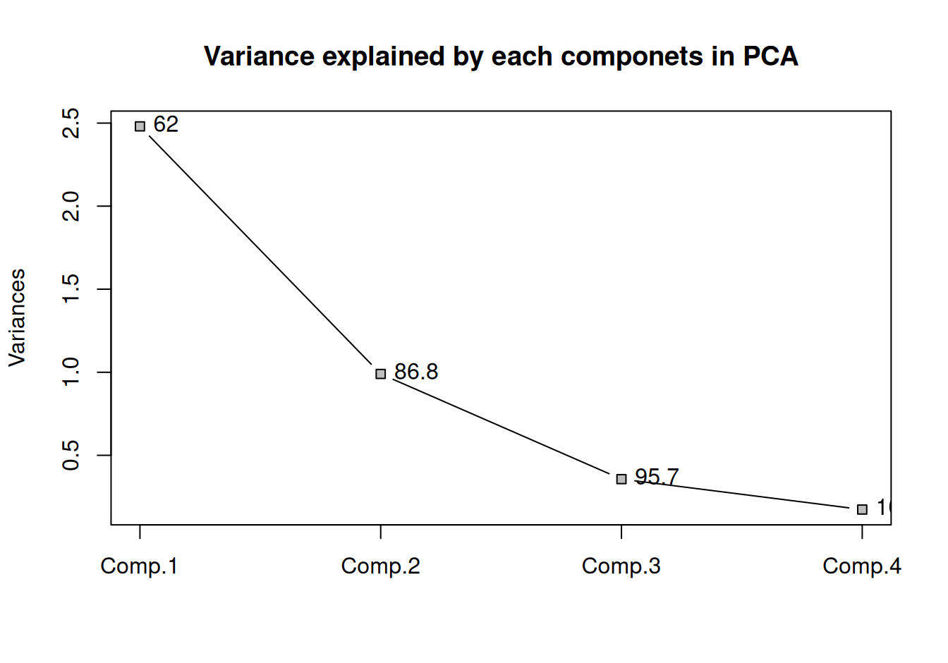
plot(pc.a, type = "lines", pch = 22, bg = "grey",
     main = "Variance explained by each componets in PCA")
text(1:4, pc.a$sdev^2, pos = 4,
     labels = round(cumsum(pls::explvar(pc.a)), 1))
box()
Figure 1: Variance of each components and the proportaion of the total variance explained for each additional components is displayed as label
Here, with three components, we have captured 95.7 percent of total variation present in USArrests dataset. Lets get the biplot and try to understand it.
library(ggfortify)
autoplot(
  pc.a, label = T, shape = FALSE,
  loadings = TRUE, loadings.label = TRUE,
  label.size = 3.5, label.repel = TRUE)